Frontend
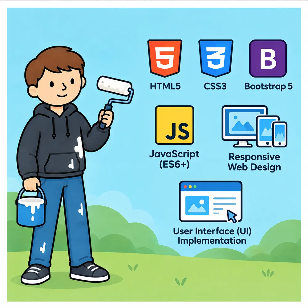
Our projects use semantic HTML5, CSS3, Bootstrap 5, and modern JavaScript to build responsive interfaces that are accessible, maintainable, and consistent across different devices and browsers.
We use semantic HTML5 to create clear document structures that work well for both users and search engines. CSS3 handles the visual layer, including Flexbox, Grid, custom properties, responsive layouts, and keyframe animations for interface details and micro-interactions.
For projects that benefit from a ready-made responsive framework, we use Bootstrap 5 for its mobile-first grid system and reusable components such as navigation bars, cards, modals, and forms. We customize these components rather than being limited by their default appearance.
We write modular ES6+ JavaScript for dynamic functionality, using features such as async/await, fetch, DOM manipulation, and array methods. Depending on the project, this can include API communication, dynamic data rendering, form validation, interactive elements, and client-side state handling.
Responsive design is built into the implementation from the beginning, using mobile-first media queries, fluid typography, flexible images, and layouts that adapt across a wide range of screen sizes.
We also pay attention to the details that make an interface feel finished: translating design mockups into working pages, implementing hover, active, disabled, loading, and error states, and testing the result across Chrome, Firefox, Safari, and Edge.
The goal is not simply to make a page look right at one screen size, but to build an interface that remains usable, consistent, and responsive wherever it is opened.